
The palettes below run from wine and charcoal through near-black with neon flickers, and the one that holds up in your room depends on the window you have, not the mood board you fell for.
A north-facing bedroom needs teal with green undertones to avoid evening coldness, while purple demands stricter testing than teal because it absorbs more light than it reflects.
1. Deep Burgundy and Charcoal Grey
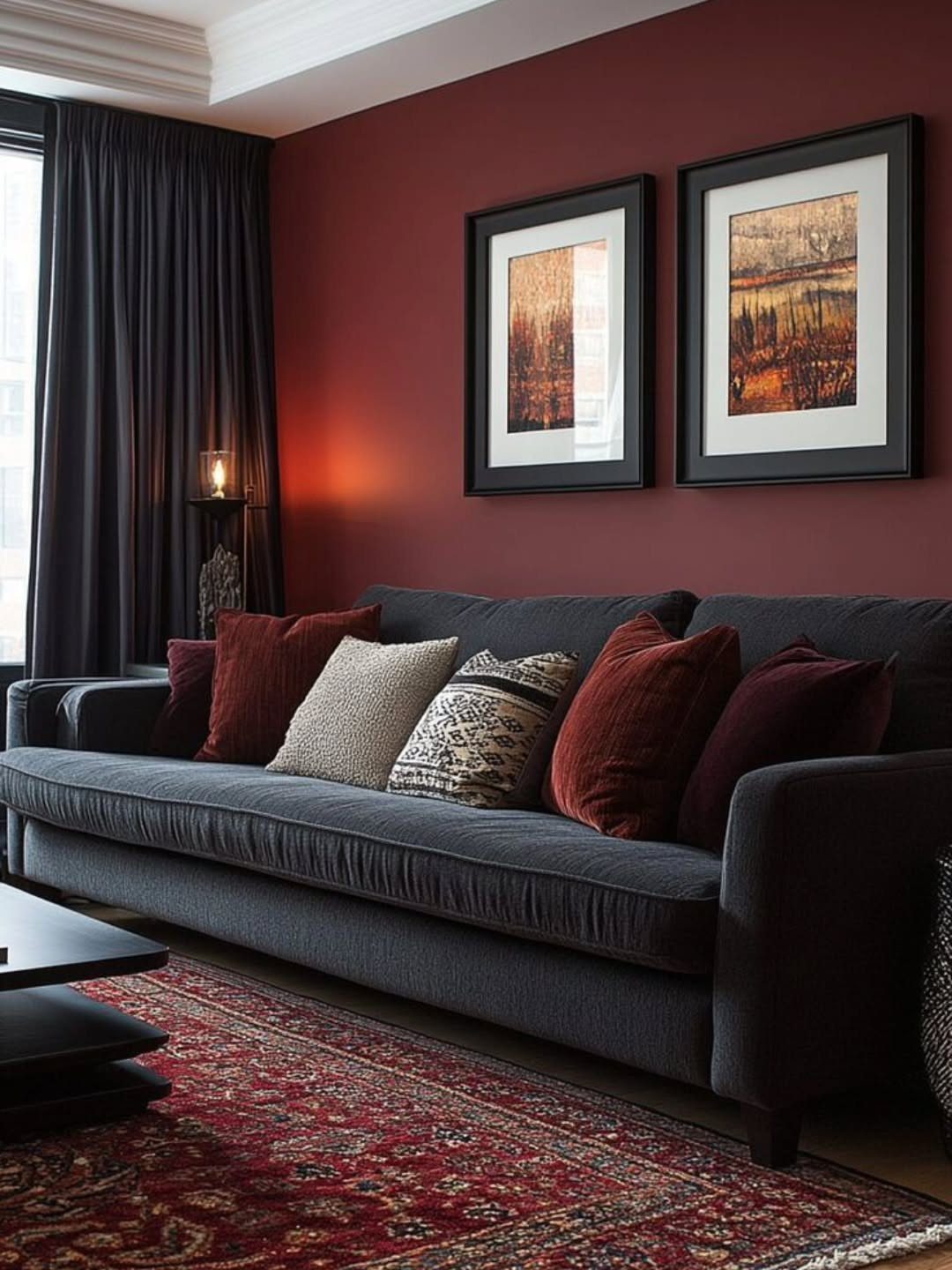
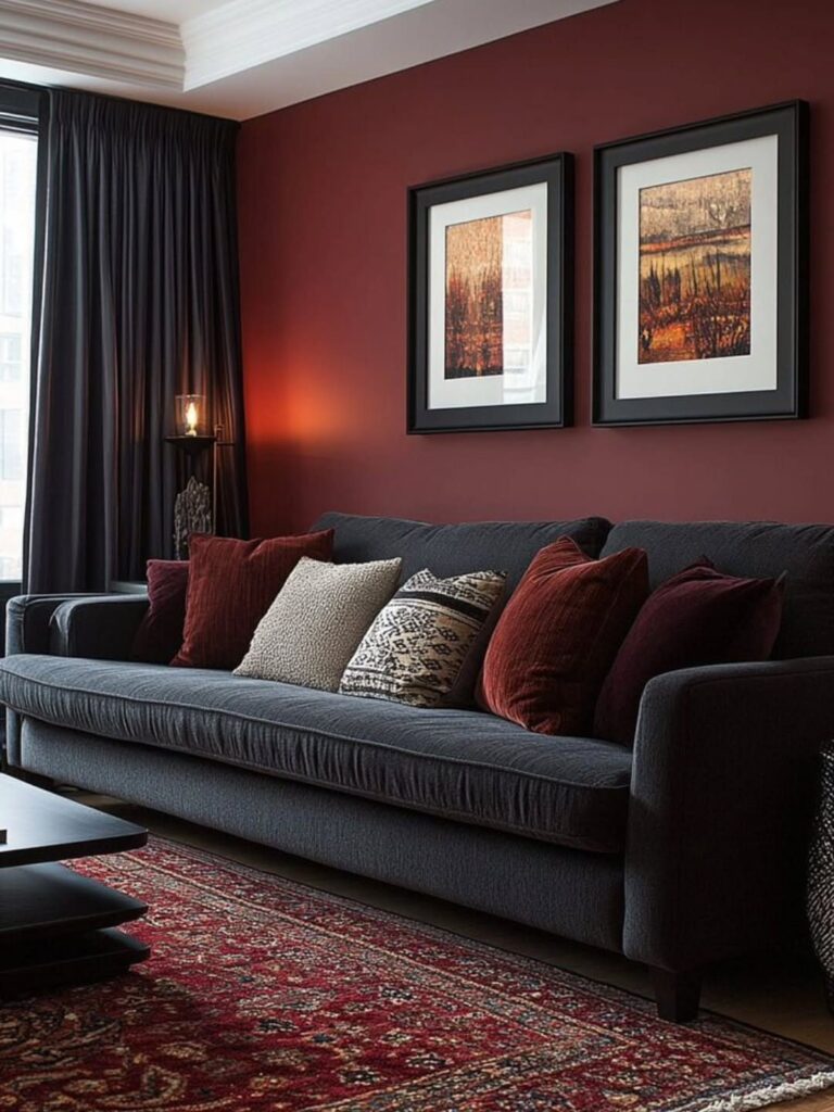
Deep burgundy and charcoal grey pair into a living room that reads as warm rather than cold, which is harder to pull off with dark walls than most people expect.
Keep the burgundy deep enough that it does not read as red; go too bright and the room feels like a restaurant booth.
Charcoal on the sofa keeps the grounding neutral from going flat, and the patterned rug adds texture without a third strong color.
I would keep the cushions muted, since the sofa already carries that red tone in its pillows. This palette suits spaces where you want the walls to do the work and the furniture to calm it down.
2. Moody Forest Green with Black
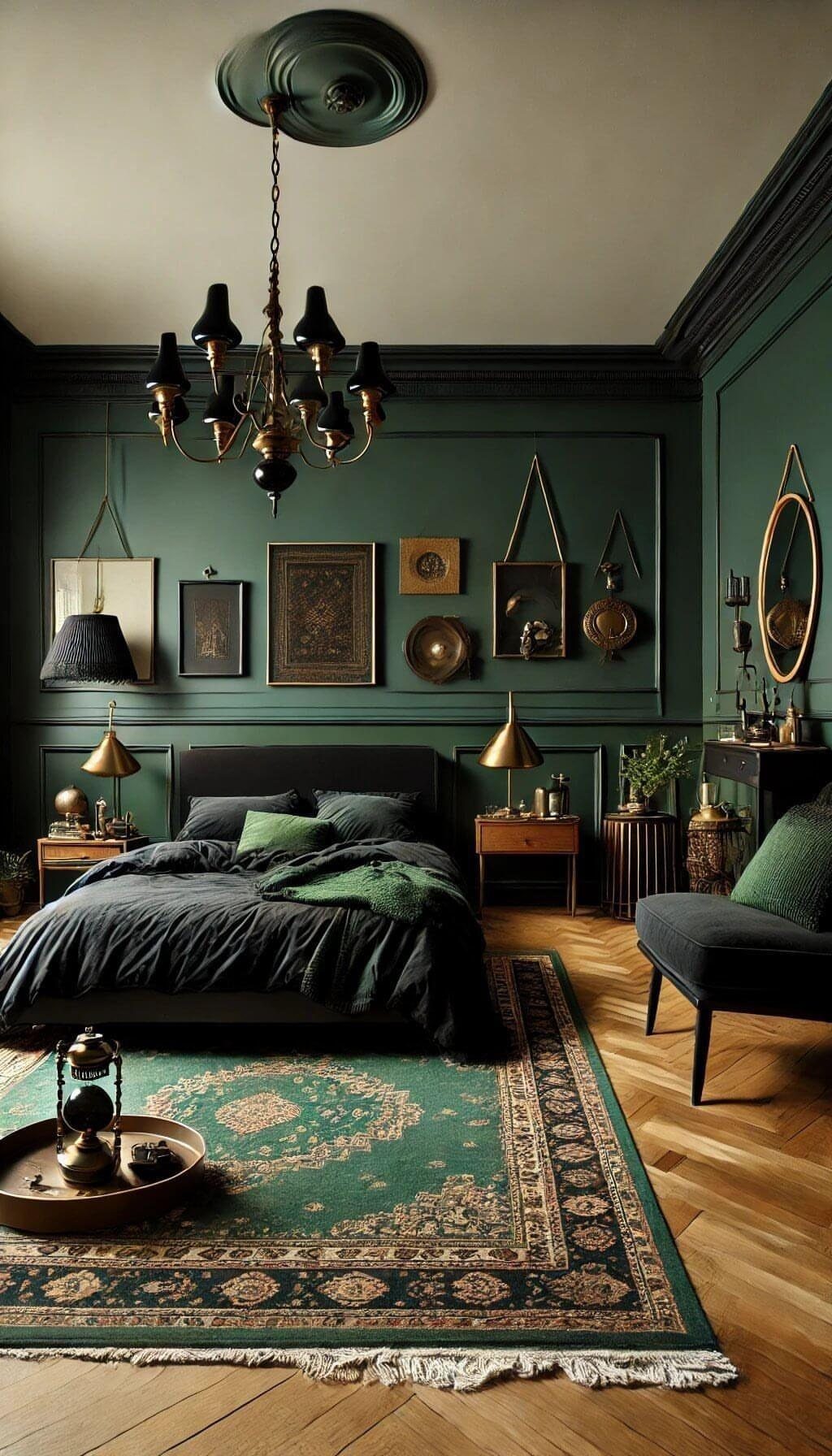
Forest green walls with black furniture can turn a bedroom into something that feels enclosed rather than cozy if the green goes too dark.
A forest green that sits right at the edge works best, bright enough that the chandelier catches it and the wood floors still show warmth.
Black on the bed frame and linens pushes the green forward instead of competing. The patterned rug breaks up the darkness underfoot, which matters more than people think; a solid dark rug would make the floor disappear.
For a similar feel in a smaller room, I would keep the green on one wall and use a softer sage on the others, since full enclosure needs more square footage than most bedrooms have.
3. Dark Purple with Gold Accents
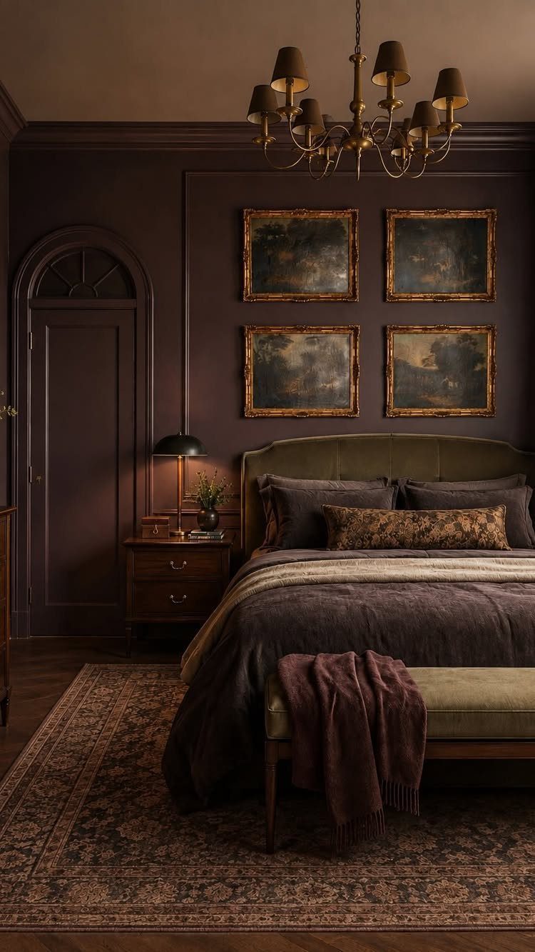
Purple walls carry a risk of reading as adolescent, but the deep shade here, close to eggplant, avoids that by staying muted rather than bright.
Gold frames warm it up in a way silver or black would not; the metal picks up any available light and keeps the room from feeling like a cave.
4 frames in a grid is a specific choice that reads as intentional rather than accumulated, and the dark bedding lets the wall be the feature.
I would not add more gold after the frames and the chandelier; the palette works because the accents stay scarce. This suits rooms with some natural light, since purple absorbs more than it reflects.
4. Dark Teal with Gold Accents
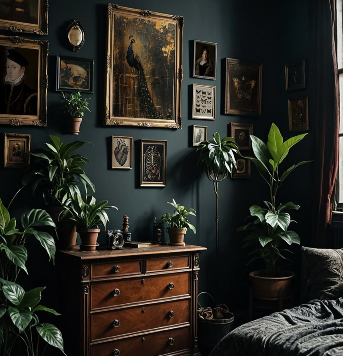
Dark teal has the unusual quality of reading as both moody and clean, which makes it forgiving for a bedroom corner where clutter accumulates.
The gold frames against it feel less formal than gold against purple would; the green undertone in teal keeps things casual.
The houseplants add a second green that works because it is brighter and natural against the painted wall, not competing with it. A vintage wooden dresser bridges the 2 temperatures.
For the wall color, look for a teal that carries more green than blue; the blue-heavy versions turn cold in evening light. I have seen this palette work well in north-facing rooms where warmer colors go muddy.
5. Deep Navy and Black Sand

Deep navy and black sand come from nature already harmonized, which is why this palette feels effortless even though two near-darks together usually fight.
The white foam gives the eye a rest and provides the contrast that makes the darks readable; without it, the tones would blur.
For a website or brand using this, I would pull the navy for backgrounds and the black sand for text or secondary surfaces, keeping the white for buttons or calls to action.
The gradient from navy to near-black in the water shows how to transition between them without a hard line. This suits projects that need to feel grounded and premium without the warmth of brown or green.
Explore deep and moody color palettes to bring sophistication and mystery to your designs.
— Figma
6. Neon Accents on Deep Black

Neon on black is the palette of gaming interfaces and creative portfolios for a reason: the dark recedes and the bright color advances with almost no effort.
Purple, orange, and pink together is more colors than I would typically suggest; one or two neons against black usually carries more punch. The glow effect matters here, since flat neon can read as cheap.
For a website, I would limit the neons to one primary and one for hover states, using white for text rather than trying to read against a glowing color.
Electric blue, neon green, and hot pink are the standard choices for a reason; they have the most contrast against #0D0D0D.
This trades away subtlety for energy, which is the right call when the project needs to feel current rather than timeless.
Applying Dark Mode Consistently
The hardest part of a dark palette is not choosing it; it is keeping it intact as the work grows.
I have watched dark mode implementations erode because one designer’s charcoal was slightly warmer than another’s, and no one caught it until the pages sat side by side.
The cleanest fix is to define colors as variables before anything ships.
Background, text, borders, and accents each get one named value, and every component pulls from that source. When the background needs to shift from #181818 to #0D0D0D, you change one line, not forty.
A neutral ramp built in pairs helps: each light value has a dark equivalent, and they map symmetrically.
Saturated colors work the same way, with swatches that mirror across the midpoint. This lets a button or a hover state flip themes without redesigning the component itself.
For teams, the single source of truth matters more than the specific system you choose. Memory and handoffs are where consistency dies.
Psychology of Dark Colors
Dark colors do their best work in the gaps they leave.
A near-black background removes distraction and pulls the eye toward whatever sits on top of it, which is why focus feels easier on dark interfaces. The mood reads as sophisticated because the palette withholds rather than announces.
Pairing dark grounds with saturated accents changes the emotional register entirely.
Orange, purple, or yellow against charcoal carries energy that muted palettes cannot; the contrast is neurological, not just visual. The dark recedes, the bright advances, and the result feels playful rather than solemn.
This is where dark palettes split in purpose. The same deep background that calms a reading interface can energize a creative portfolio when the accent colors shift from restrained to vivid.
I would keep the accents scarce either way. One or two bright values carry more weight than three competing for attention.
Popular Dark Color Schemes
The most usable dark schemes tend to borrow from colors that already carry depth in nature or culture. Deep blues, rich browns, and charcoal grays dominate because they each offer a different temperature without fighting the eye.
Midnight navy and dark indigo read cooler and more technical; they suit interfaces that want to feel precise.
Chocolate and espresso browns bring warmth that charcoal cannot, which matters in spaces meant for longer stays. Charcoal itself sits between them, neutral enough to let other colors advance.
For creative work, the less common darks have their place. Eggplant and deep plum carry a theatrical quality that navy does not; hunter green and dark olive feel grounded in a way that edges toward the organic.
Each of these needs more care with lighting than the near-neutrals do, since purple absorbs light and green can turn muddy in the wrong conditions.
The practical choice is usually one of the three standards: blue for distance, brown for warmth, gray for flexibility.
Frequently Asked Questions
What is a dark color palette?
A dark color palette pulls together saturated shades that sit low on the lightness scale, think burgundy, forest green, or charcoal rather than their brighter cousins.
In RGB terms, each channel runs under 128, which is why these colors hold enough contrast for text to stay legible while still feeling moody and pulled-back.
The real work is not picking the colors; it is building the system that keeps them consistent across every page and platform after the first design ships.
Which color is best for dark colors?
Deep blues, rich browns, charcoal grays, dark purples, and forest greens are the most reliable choices.
Midnight navy and dark indigo give sophisticated depth; chocolate and espresso bring warmth; charcoal ranges from soft slate to deep stone for modern minimalism. The best choice depends on what temperature you want the space or screen to carry.