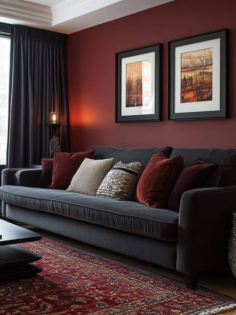
The palettes below run from wine and charcoal through near-black with neon flickers, and the one that holds up in your room depends on the window you have, not the mood board you fell for.
A north-facing bedroom needs teal with green undertones to avoid evening coldness, while purple demands stricter testing than teal because it absorbs more light than it reflects.
1. Deep Burgundy and Charcoal Grey
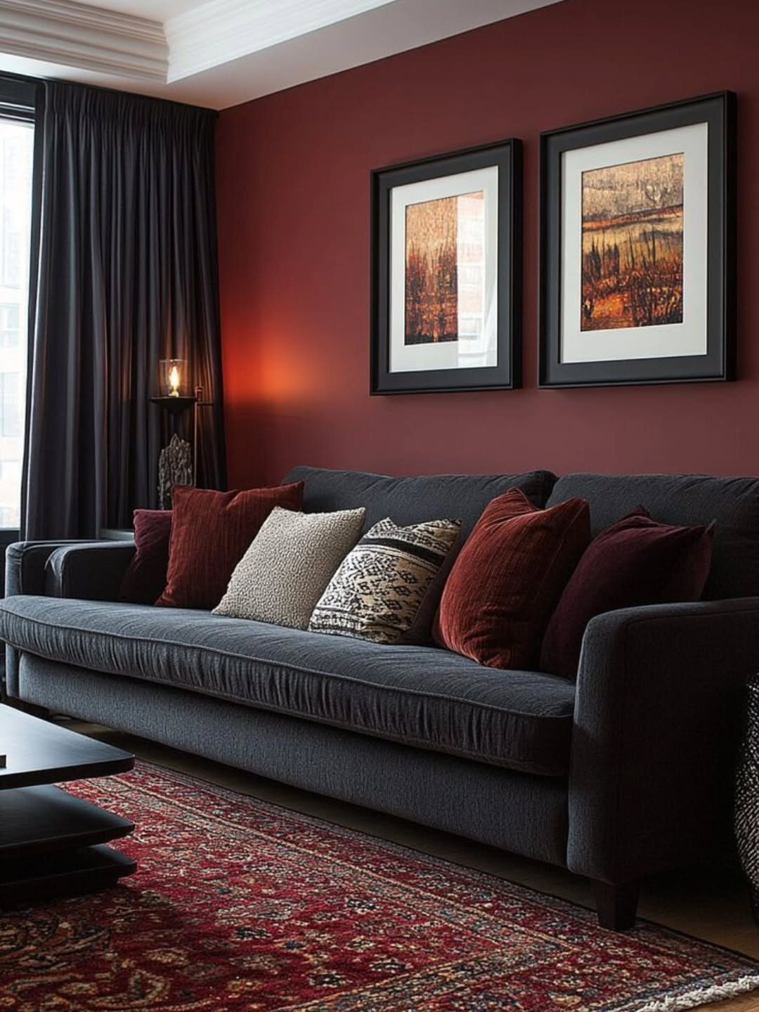
Deep burgundy and charcoal grey pair into a living room that reads as warm rather than cold, which is harder to pull off with dark walls than most people expect.
Keep the burgundy deep enough that it does not read as red; go too bright and the room feels like a restaurant booth.
Charcoal on the sofa keeps the grounding neutral from going flat, and the patterned rug adds texture without a third strong color.
I would keep the cushions muted, since the sofa already carries that red tone in its pillows. This palette suits spaces where you want the walls to do the work and the furniture to calm it down.
2. Moody Forest Green with Black
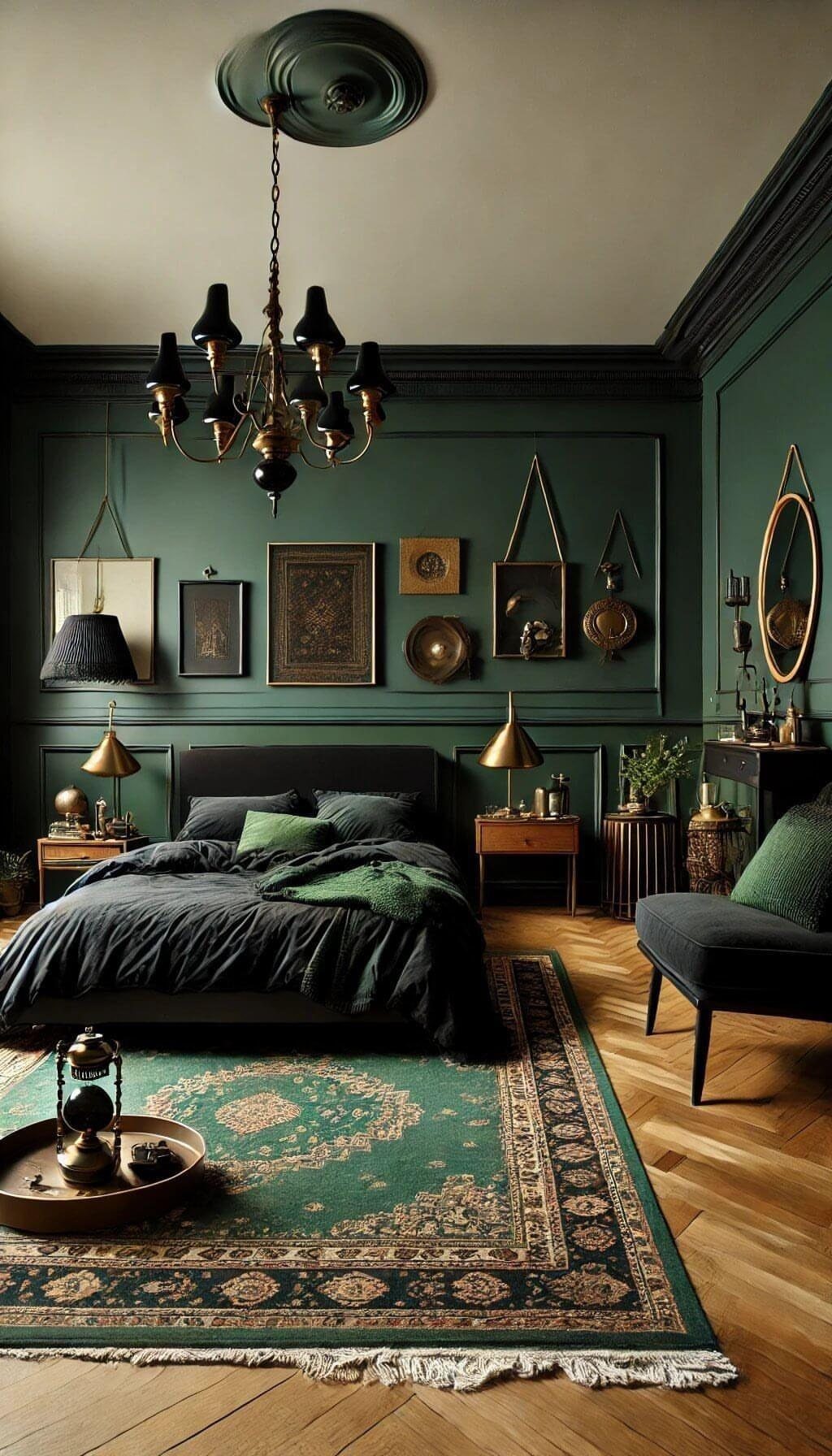
Forest green walls with black furniture can turn a bedroom into something that feels enclosed rather than cozy if the green goes too dark.
A forest green that sits right at the edge works best, bright enough that the chandelier catches it and the wood floors still show warmth.
Black on the bed frame and linens pushes the green forward instead of competing. The patterned rug breaks up the darkness underfoot, which matters more than people think; a solid dark rug would make the floor disappear.
For a similar feel in a smaller room, I would keep the green on one wall and use a softer sage on the others, since full enclosure needs more square footage than most bedrooms have.
3. Dark Purple with Gold Accents
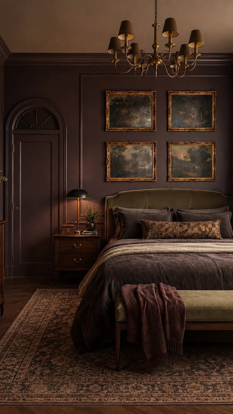
Purple walls carry a risk of reading as adolescent, but the deep shade here, close to eggplant, avoids that by staying muted rather than bright.
Gold frames warm it up in a way silver or black would not; the metal picks up any available light and keeps the room from feeling like a cave.
4 frames in a grid is a specific choice that reads as intentional rather than accumulated, and the dark bedding lets the wall be the feature.
I would not add more gold after the frames and the chandelier; the palette works because the accents stay scarce. This suits rooms with some natural light, since purple absorbs more than it reflects.
4. Dark Teal with Gold Accents
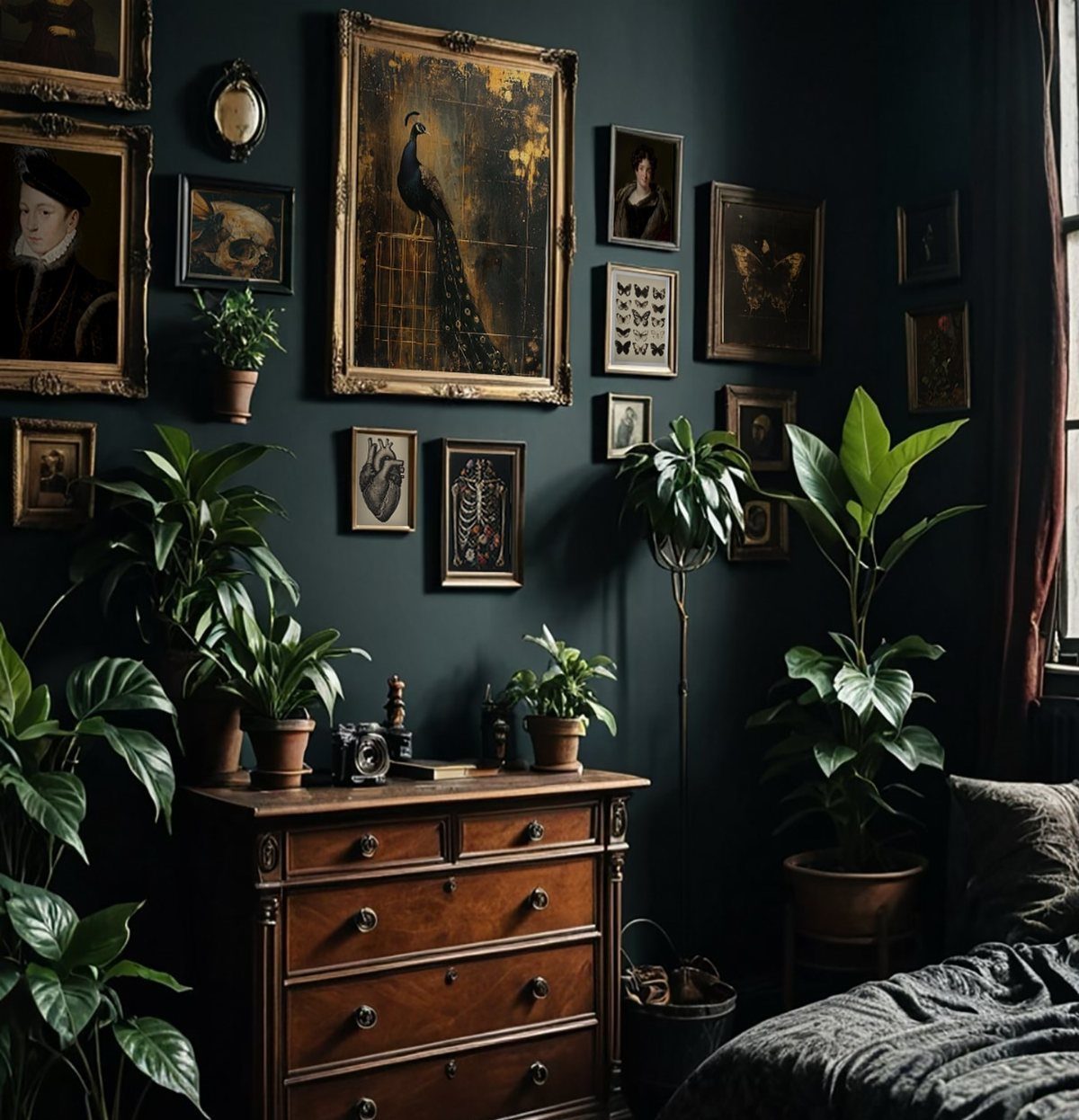
Dark teal has the unusual quality of reading as both moody and clean, which makes it forgiving for a bedroom corner where clutter accumulates.
The gold frames against it feel less formal than gold against purple would; the green undertone in teal keeps things casual.
The houseplants add a second green that works because it is brighter and natural against the painted wall, not competing with it. A vintage wooden dresser bridges the 2 temperatures.
For the wall color, look for a teal that carries more green than blue; the blue-heavy versions turn cold in evening light. I have seen this palette work well in north-facing rooms where warmer colors go muddy.
5. Deep Navy and Black Sand

Deep navy and black sand come from nature already harmonized, which is why this palette feels effortless even though two near-darks together usually fight.
The white foam gives the eye a rest and provides the contrast that makes the darks readable; without it, the tones would blur.
For a website or brand using this, I would pull the navy for backgrounds and the black sand for text or secondary surfaces, keeping the white for buttons or calls to action.
The gradient from navy to near-black in the water shows how to transition between them without a hard line. This suits projects that need to feel grounded and premium without the warmth of brown or green.
Explore deep and moody color palettes to bring sophistication and mystery to your designs.
— Figma
6. Neon Accents on Deep Black

Neon on black is the palette of gaming interfaces and creative portfolios for a reason: the dark recedes and the bright color advances with almost no effort.
Purple, orange, and pink together is more colors than I would typically suggest; one or two neons against black usually carries more punch. The glow effect matters here, since flat neon can read as cheap.
For a website, I would limit the neons to one primary and one for hover states, using white for text rather than trying to read against a glowing color.
Electric blue, neon green, and hot pink are the standard choices for a reason; they have the most contrast against #0D0D0D.
This trades away subtlety for energy, which is the right call when the project needs to feel current rather than timeless.
Applying Dark Mode Consistently
The hardest part of a dark palette is not choosing it; it is keeping it correct after the first page is built.
I have watched palettes drift as teams grow: one page’s background goes slightly warmer, a CTA accent shifts by a few points, and the system quietly breaks.
One master file keeps every dark-mode value from drifting out of sync across platforms.
Atlassian sets up neutral color ramps where LightNeutral100 maps directly to DarkNeutral100, and saturated colors mirror across the midpoint of 10 swatches. This means a button color converts without guesswork.
Vev Design calls this the point where most implementations fail: handoffs and memory replace the documented token, and the erosion begins. I would set the tokens before any page ships and require every component to pull from them.
No exceptions for one-off pages, no eyeballing close enough. The discipline upfront saves the palette later.
Accessibility Considerations
Dark palettes fail accessibility more often than light ones because the contrast looks sufficient to the eye and is not.
A charcoal text on a near-black background can read as crisp in a bright office and disappear on a phone at night. WCAG guidelines set the measurable floor, and tools exist to check it.
I would run every combination: background against text, accent against background, hover state against default. The ratio matters more than the aesthetic.
Purple absorbs more light than it reflects, which means it needs stricter testing than teal. I would not trust my own judgment on this; the tools exist precisely because designers misjudge.
Test early and retest after any palette shift. A dark mode that excludes readers is not a style choice, it is a barrier.
Dark Color Combinations
Medium darks sit on top for cards and secondary elements. Light colors carry text and icons.
Bright accents mark what needs action. This is the hierarchy that keeps a dark screen readable.
Emerald, sapphire, and ruby all sit well in dark interfaces because they follow the same hierarchy: a rich black like #1A1A1A for ground, off-white like #F0F0F0 for text, and the saturated colors saved for buttons and calls to action.
I would not reverse this and put a bright jewel tone behind text; the eye tires faster and the content becomes decoration.
Color Palette Generators
Generators help when you are starting from a brand color and need the full system built out. Colorffy turns core colors into production-ready light or dark themes with export to Tailwind, CSS, and native tokens for mobile.
Some generators offer over two thousand preset palettes, though I would treat any preset as a starting point, not a final choice.
Colormagic offers dark palettes with exact HEX codes and emphasizes the practical claims: reduced eye strain, premium feel, contemporary tone.
I have not tested every generator against every screen, so I would verify any output with a contrast checker before shipping.
The useful function of these tools is consistency across platforms, not inspiration. A generator is most useful when your brand color is already fixed; it will build the ramp and the tokens from there.
Frequently Asked Questions
What is a dark color palette?
A dark color palette pulls together saturated shades that sit low on the lightness scale, think burgundy, forest green, or charcoal rather than their brighter cousins.
In RGB terms, each channel runs under 128, which is why these colors hold enough contrast for text to stay legible while still feeling moody and pulled-back.
The real work is not picking the colors; it is building the system that keeps them consistent across every page and platform after the first design ships.
Which color is best for dark colors?
Deep blues, rich browns, charcoal grays, dark purples, and forest greens are the most reliable choices.
Midnight navy and dark indigo give sophisticated depth; chocolate and espresso bring warmth; charcoal ranges from soft slate to deep stone for modern minimalism. The best choice depends on what temperature you want the space or screen to carry.