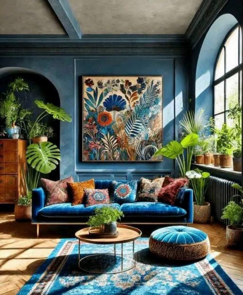
The 4 palettes below range from a single accent wall to full room color, and the right one depends on how much saturated color you can live with day to day.
A sapphire sofa against gray walls with turquoise in the ottoman is the lightest entry point; emerald and violet with dark teal paneling is the deepest commitment.
The common thread is a neutral that does the quiet work: warm whites on trim, brass through fixtures, or walnut in wood tones so the jewel tone stays bright without turning cartoonish.
1. Sapphire, Turquoise, and Gray
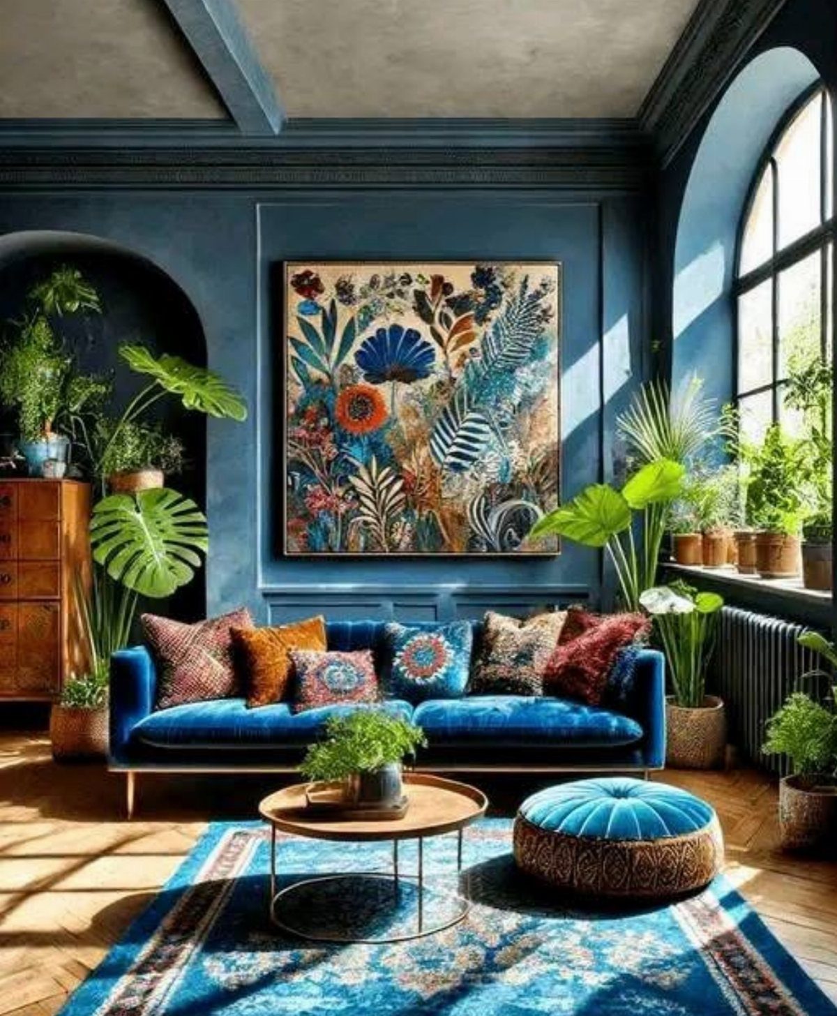
A sapphire sofa against gray walls reads like deep water meeting a foggy shore, and turquoise in the ottoman wakes the whole thing up without fighting for attention.
I like this pairing for anyone who wants jewel tones but worries about living inside a jewelry box; the gray does the quiet work so the blues can stay bright.
If you are testing this at home, start with the neutral base.
Paint the walls gray, add the sofa, then bring turquoise in through something you can move: an ottoman, a tray, a vase. That way you live with the balance before you commit to built-ins or rugs.
Houseplants do more here than fill space. Their green is the cool undertone that keeps sapphire and turquoise from turning cartoonish against all that blue.
2. Room-By-Room Jewel Tone Guidance
I would paint a dining room in the richest, most saturated jewel tone I could find. A wall in emerald or ruby, brass fixtures overhead, and dinner suddenly has weight to it.
Bedrooms need the opposite instinct; keep the jewel tone low, on one wall or the lower half, and let warm white handle the ceiling and trim so you can still wind down.
Entryways and powder rooms sit in between.
The door opens and a deep green or a saturated coral says something before anyone has taken off their coat. Powder rooms work because they are small and brief; a bold color there reads as confident, not suffocating.
If you are unsure, borrow the temporary test I have seen work: flowers in citrine or emerald, throw pillows in sapphire or amethyst. Live with the color for a week before you order the sofa or book the painter.
3. Emerald and Violet Living Room
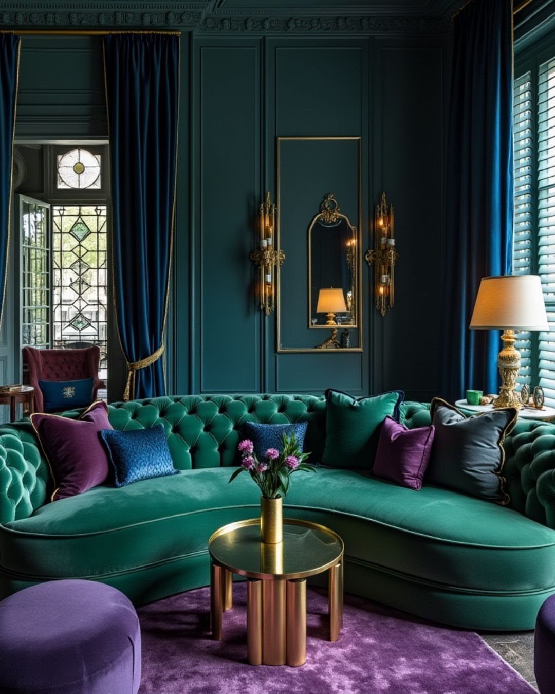
Emerald and violet together need a third color to keep them from collapsing into each other, and the dark teal paneling here does that job like a referee.
The sofa owns the green, the pillows and rug carry the purple, and the walls split the difference so neither color has to fight alone.
This is a living room for someone who entertains, or at least wants to feel dressed when they walk in with groceries. The gold coffee table adds warmth that both colors accept; without it, the room would tilt cold.
I would not try this palette in a bedroom unless you sleep soundly through anything.
The saturation here is meant to be seen and talked around. For a first step, swap in purple pillows on a green sofa you already own and watch how the light hits them at different hours.
4. Deep Blue Cabinets with Brass
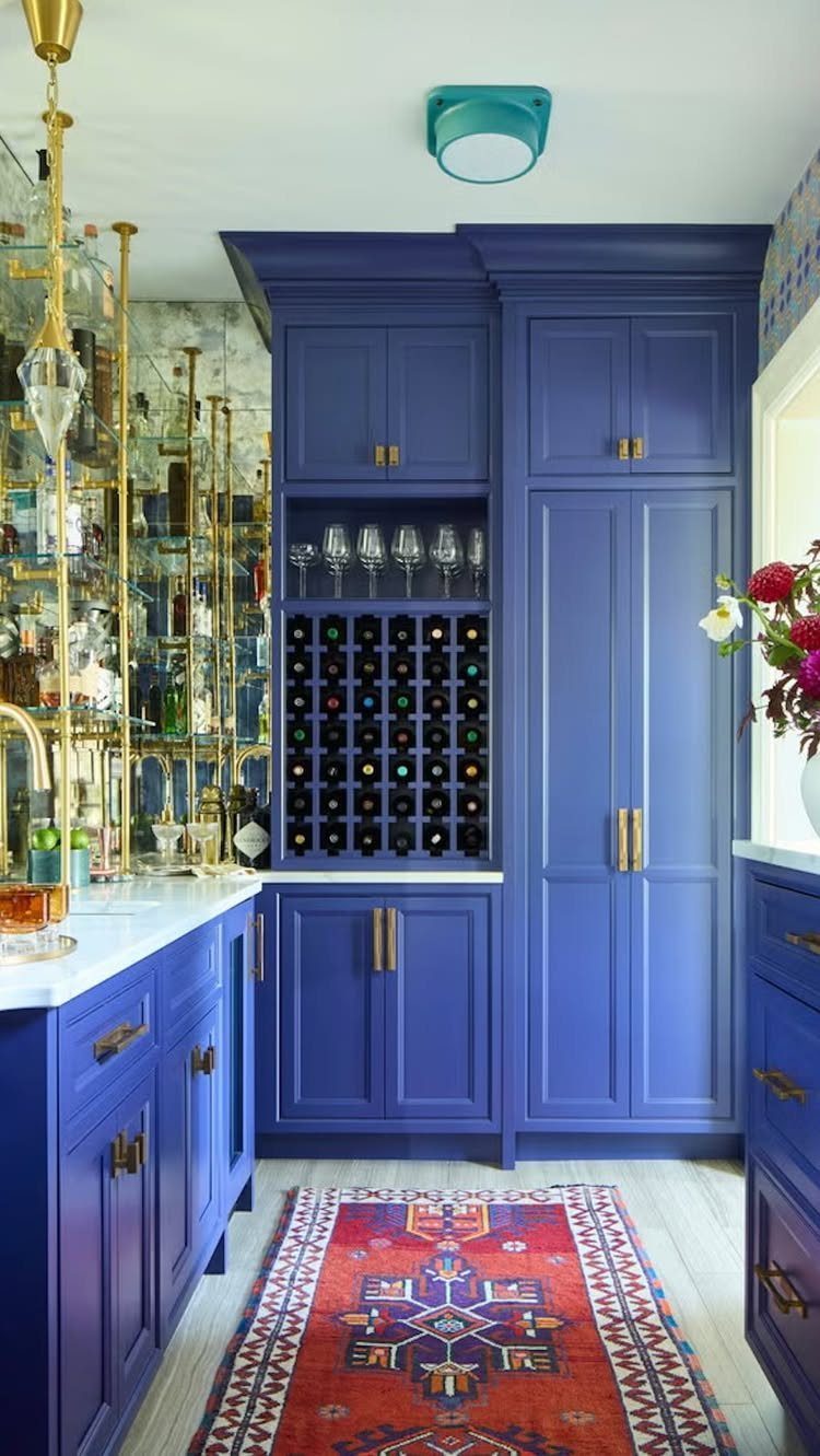
Deep blue cabinets with brass hardware turn a bar or kitchen into something you want to open. The blue here is near-black in shadow and alive in direct light, and the brass catches both states without competing.
The red and blue runner underneath is the move I would copy: it adds pattern and a second warm metal moment through whatever small accents sit on the shelves.
Without that rug, the floor would go quiet and the cabinets would feel like they are floating.
If you are choosing the blue, test depth against your light.
A near-black navy works best where you pass through; if the room is where you stand and chop or mix drinks, a step lighter keeps the space usable after dark.
Always check the sample against your trim at the hour you will actually be in the room.
How to Choose Jewel Tones
The first question is depth. Hold a paint chip against white paper and look for the undertone; a sapphire that leans purple reads very different from one that leans green, and that undertone decides everything else in the room.
Warm whites like Warm Linen (#EAE3D2) or Warm Chalk White keep trim and ceilings from going clinical.
Brass or brushed gold finishes the palette through frames, lighting, and hardware; you do not paint the metal, you place it. Wood browns like Burnished Walnut warm the room in a quieter register if metal feels too bright.
Jewel Tones in Small Spaces
Mudrooms and home offices are where jewel tones make the most sense in a small footprint. The color reads as intentional rather than accidental because the room itself is brief; you pass through, you do not live there for hours.
Emerald works especially well here, deep enough to matter, green enough to stay calm. Balance still applies.
A warm white ceiling and a single metallic accent keep the walls from pressing in. If the room has no natural light, step the color lighter by one chip or the space turns cave-like by 4:00 PM.
Testing Colors Before Commitment
Rich colors change the most once the light drops, so I look at them where they’ll be at their heaviest, morning light and then again after I flip the lamps on.
If your local store carries something else, the palette still holds together.
Pairing with Neutrals
Jewel tones need something still beside them so your eye has a place to land. Brass or brushed gold picks up the gemstone feeling and adds warmth; a wood tone like Burnished Walnut does something similar, just gentler.
Testing two of the same jewel tones in different shades, a lighter yellow against a deeper purple, gives the sophisticated look without the room going glum.
Frequently Asked Questions
What colors complement jewel tones?
Warm whites, soft neutrals, and metallic accents are the 3 partners that keep jewel tones from overwhelming a room.
A warm white like Warm Linen or Warm Chalk White on trim and ceilings prevents the space from closing in, while brass or brushed gold hardware and lighting echo the gemstone quality and add warmth.
Burnished Walnut and similar wood browns do the same grounding work if brass or gold feels too flashy for your space.
Are jewel tones in for 2026?
Jewel tones stay current because they occupy a specific middle ground: deep enough to read as rich, clear enough to avoid muddiness, never pastel.
Emerald in particular works as a focal point without exhausting the eye because green itself is restful.
Are jewel tones too dark for a small room?
Small rooms can handle jewel tones when the color is treated as intentional rather than accidental.
Which jewel tone is the most popular for walls?
Emerald green wins by a wide margin in paint sales and shelter magazines both. A green wall commands attention without exhausting the eye, which is why it works in entry halls and living rooms more often than bedrooms.
Sales numbers stay strong when the green is cut with warm white trim and a single brass accent to keep it from going flat.